While PowerHome does not incorporate "native" charting capability, it is possible to chart just about any data that PH can access, using the following Google Charts extraordinarily capable API.
Introductory documentation is available here...
https://google-developers.appspot.com/chart/interactive/docs /index
and a wonderful Help Forum with quick responses and terrific mentors here...
https://groups.google.com/forum/#!forum/google-visualization -api
Using the Google API, coupled with a very moderate amount of javaScrip it is possible to display graphs of any numeric values that PH can access.
As an aside, what is documented below is for Line Charting, but the Google Chart API is astoundingly capable, allowing for the creation of line, pie, donut, column, area, scatter, and more charts. You can even create these Gauges ...
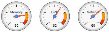
The example documentation here is broadly general, and shows a web page displaying 3 different charts, but this dialog will only cover a single chart, the DAY chart. The others are similar, but have different axis parameters and Timed Event firing schedules..
The Line chart shown below (the DAY chart) is one chart of the trio.
This chart is created from the following web page...
chartTemps.html: The web page that presents the charts using the Google Charts API. This page is almost entirely javaScript, but it is heavily commented to help it be as understandable as possible. This web page is constructed to create the three charts using a single function, drawChart(), and passing parameters to it in the call, that define the axis ranges, various labels, input csv file, etc.
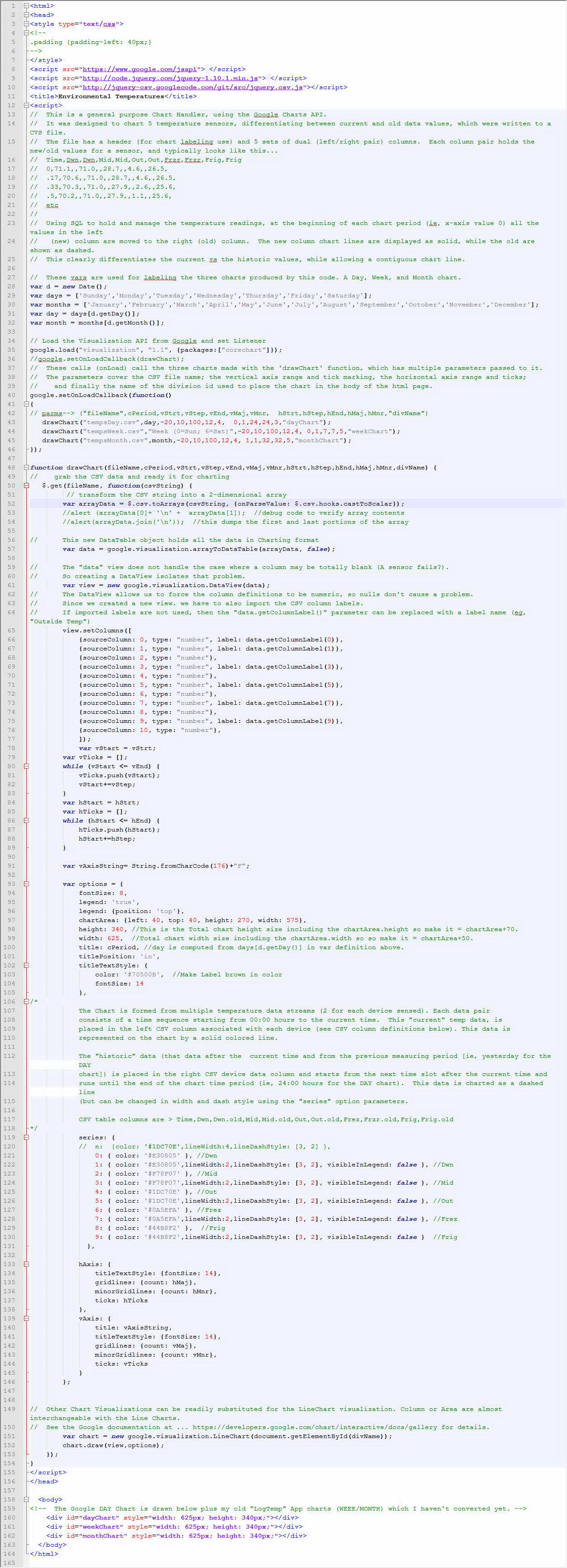
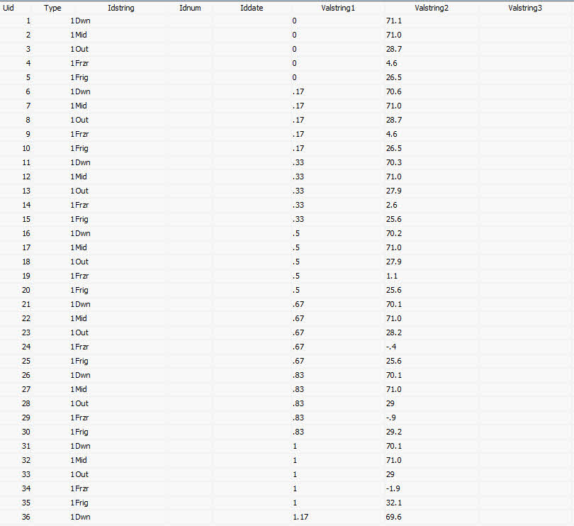
The chart was produced from data contained in a CSV file that looks like this...
Time,Dwn,Dwn,Mid,Mid,Out,Out,Frzr,Frzr,Frig,Frig
0,71.1,,71,,28.7,,4.6,,26.5,
0.17,70.6,,71,,28.7,,4.6,,26.5,
0.33,70.3,,71,,27.9,,2.6,,25.6,
0.5,70.2,,71,,27.9,,1.1,,25.6,
0.67,70.1,,71,,28.2,,-0.4,,25.6,
0.83,70.1,,71,,29,,-0.9,,29.2,
1,70.1,,71,,29,,-1.9,,32.1,
1.17,69.6,,71,,28.7,,-2.4,,34.8,
1.33,69.3,,71,,28.7,,-2.4,,35.7,
1.5,69.2,,71,,28.7,,-2.9,,36.6,
. . . . .
. . . . .
22.5,72.1,,,71,,29.6,,0.6,,46.3
22.67,72.1,,,71,,29.6,,1.1,,46.5
22.83,72.6,,,71,,29.9,,1.6,,40.4
23,72.3,,,71,,29.1,,2.1,,33.7
23.17,72.2,,,71,,29.1,,2.6,,31.1
23.33,71.6,,,71,,28.8,,3.1,,30.1
23.5,71.3,,,71,,28.2,,3.6,,28.7
23.67,71.1,,,71,,28.7,,3.6,,28.3
23.83,71.1,,,71,,28.7,,4.1,,27.4
This CSV Day file contains specific DAY CHART data and timing information. There will be similar csv files for the WEEK and MONTH charts.
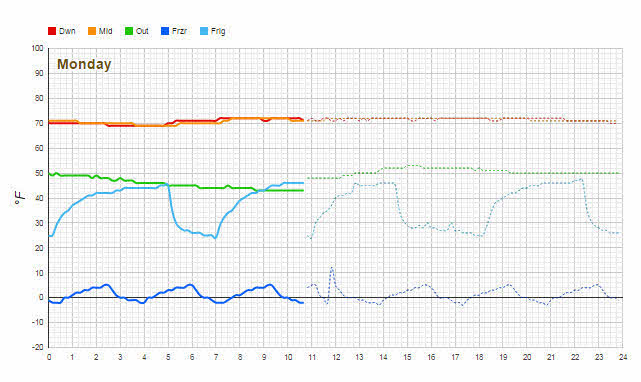
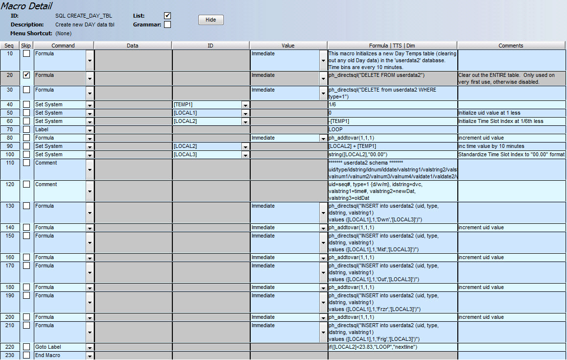
The PH "SQL UPDATE_DAY_TBL" macro produces the data for this CSV file. Whenever the chart viewing web page "chartTemps.html" is opened, it calls the Google charting API functions to chart the data from this CSV file. This Macro is called from a Timed Event that runs every 10 minutes, thus populating 6 time bins per hour, over a 24 hour day. The macro looks like this...
All of the collected data is stored in the PowrHome "userData2" database Table, and all of the database management is done using PowerHome standard SQL functions See this PH Forum link for information on that table (search for "userdata2" to find the info in this large Thread). It is on page 1..
http://www.power-home.com/forum/forum_posts.asp?TID= 2723&KW= userdata2
This example chart uses the following columns in the PH userData2 db Table ...
NOTE: The Charts show a sensor's data line as solid (for current) and dashed (for historic) data. That way you can see what was happening, at the current time in the period before, to identify any deviations from expected norms. This is handled in the Google Chart API by using SQL to move the paired (new/old) data from the left pair-column to the right column at the beginning of a new charting period (ie, midnight for the DAY chart). The Google Chart visualization (on the chartTemps.html page) charts left column data as "solid" and right column data as "dashed". The following image only shows "left" column (new) data points.
The contents of these columns is as follows...
- uid - Sequentially numbered as a unique index key
- type - In the example "1" is used to mark this as a "Day" table, since there could be a "Week" and "Month" and maybe even "Year" charts from the same general Table( Type=2,3,4).
- idstring: Not used
- idnum: Not used
- iddate - not used
- valstring1: Time expressed as a number. Required to make Google Charts use a continuous,, rather than discreet X-Axis so that data is displayed in the correct time position even if there are missing data points. The UPDATE Macro converts true time into discrete numeric bins so that everything is standardized. See above comment about my 10 minute (1/6th hour) time increments.
- valstring2: Holds the current (new) data, since 00:00 hours up to the current viewing time.
- valstring3: This column holds the historic data. This Day view is a 24 hour cyclic buffer. So if the current snapshot was at 2PM all of the day from 00:00 - 14:00 hours would be in the valstring1 column (and displayed as a solid line) while the data from 2PM to midnight would all appear in the valstring2 column, since that is historic (yesterday's data).}
- No other columns are used for Charting data but valnum1 and valnum2 are used as a ring buffer to compute long term average temps for the Frig and Frzr. This need will disappear with the release of PH 2.1.5c which will have averaging built into the Analog I/O Devices support.
In addition to these these files, an additional Macro is also useful. It is the "SQL CREATE_DAY_TABLE" which makes sure the userData2 db is cleared out before use, and then creates a set of standard data capture time bins, for use by the "SQL CREATE_DAY_TABLE" routine.
NOTE: The very first formula in this macro (normally disabled) can be enabled to assure an empty database Table. Normally it is disabled to allow just the DAY entries to be reset, in the event the db is used for multiple charts. This table covers 24 hours and has 6-bins (10 min slots) within each hour. The DAY data is all keyed as Type-1
**********************************************
OK. All the background stuff is defined, how do you use this?
1. Create Timed Events to capture your Chart data over the desired period (Day/Week/Month/etc)
2. Create a web link from your Web Center page to chartTemps.html ! This will create the actual chart(s) when you click on the web page.